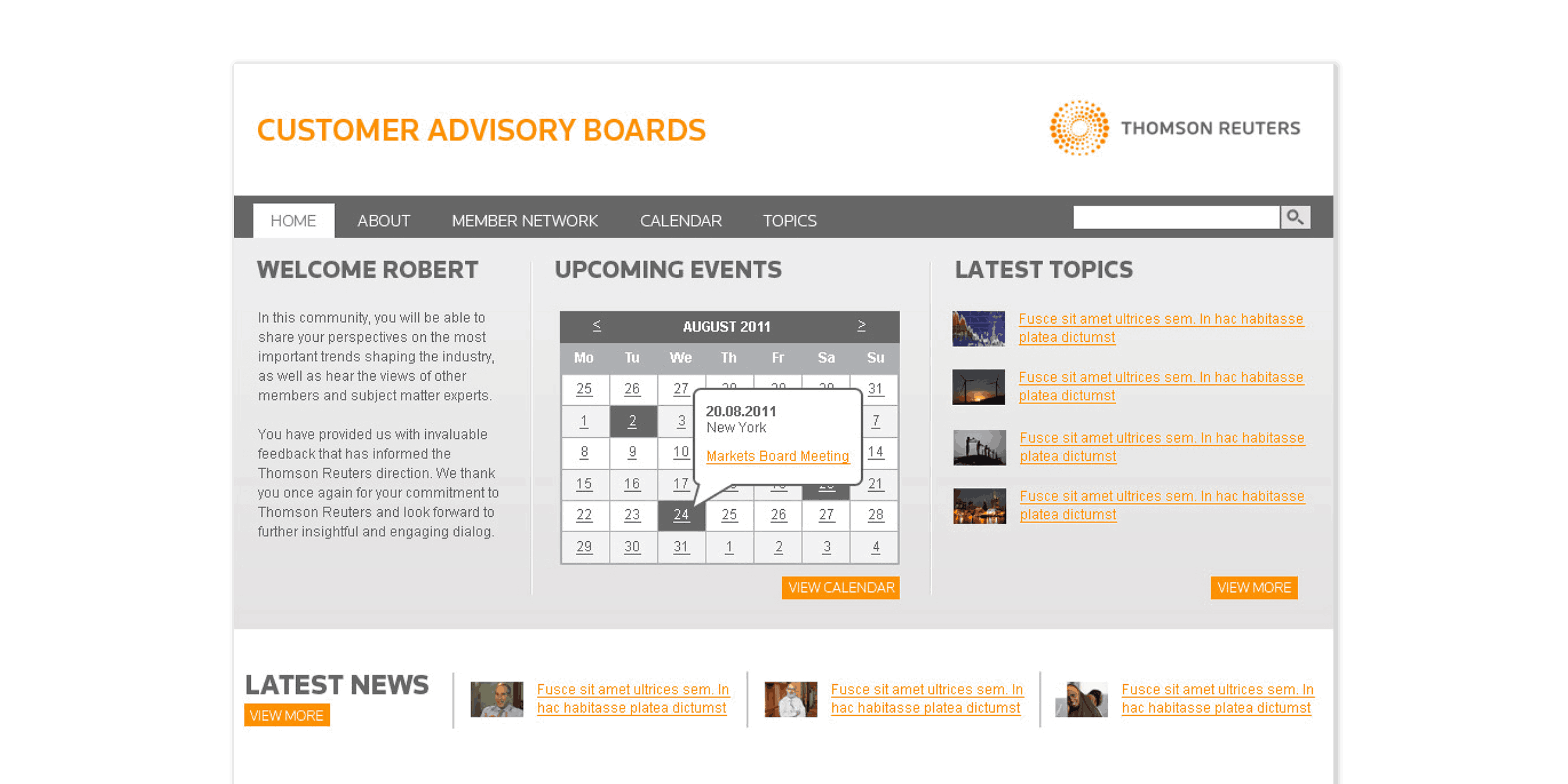
Customer Advisory Boards
Thomson Reuters
Contents
Intro
Thomson Reuters served as a global provider of business information tools and services for legal, tax, compliance, and media professionals. To enhance client engagement, efforts were made to improve transparency in project tracking.
Challenge
Clients had no easy way to monitor project progress. Updates were only accessible by direct contact with leads, while project managers relied on Outlook to manage tasks and communications. This approach led to inefficiencies and increased the likelihood of information loss.
Solution
A bespoke digital platform was developed to offer real-time visibility into project milestones for both clients and project managers. The tool was built from the ground up to streamline goal setting, task scheduling, and progress tracking, all within a clear and intuitive user interface.
1. Introduction

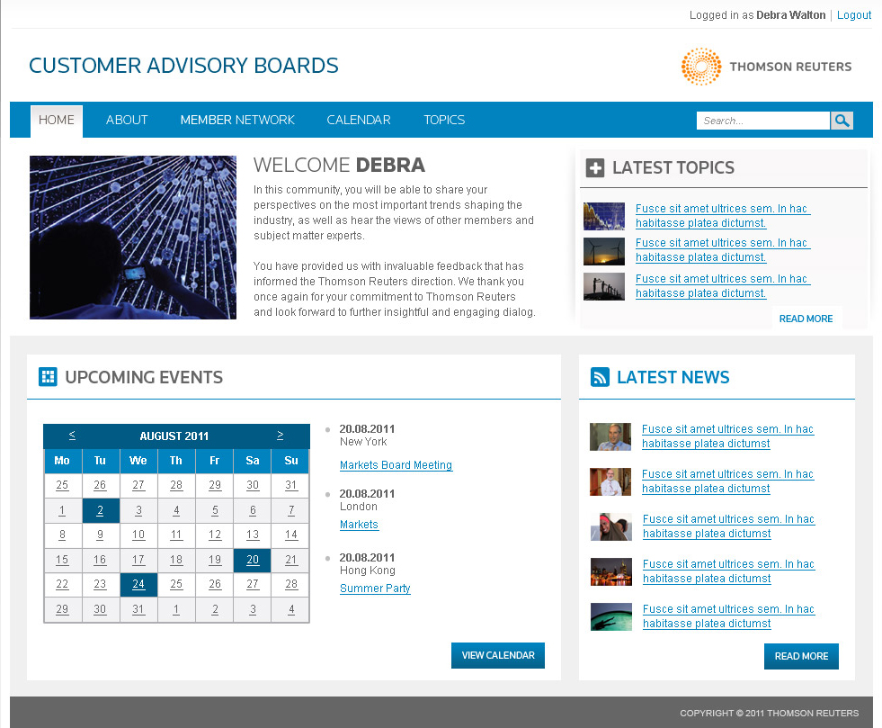
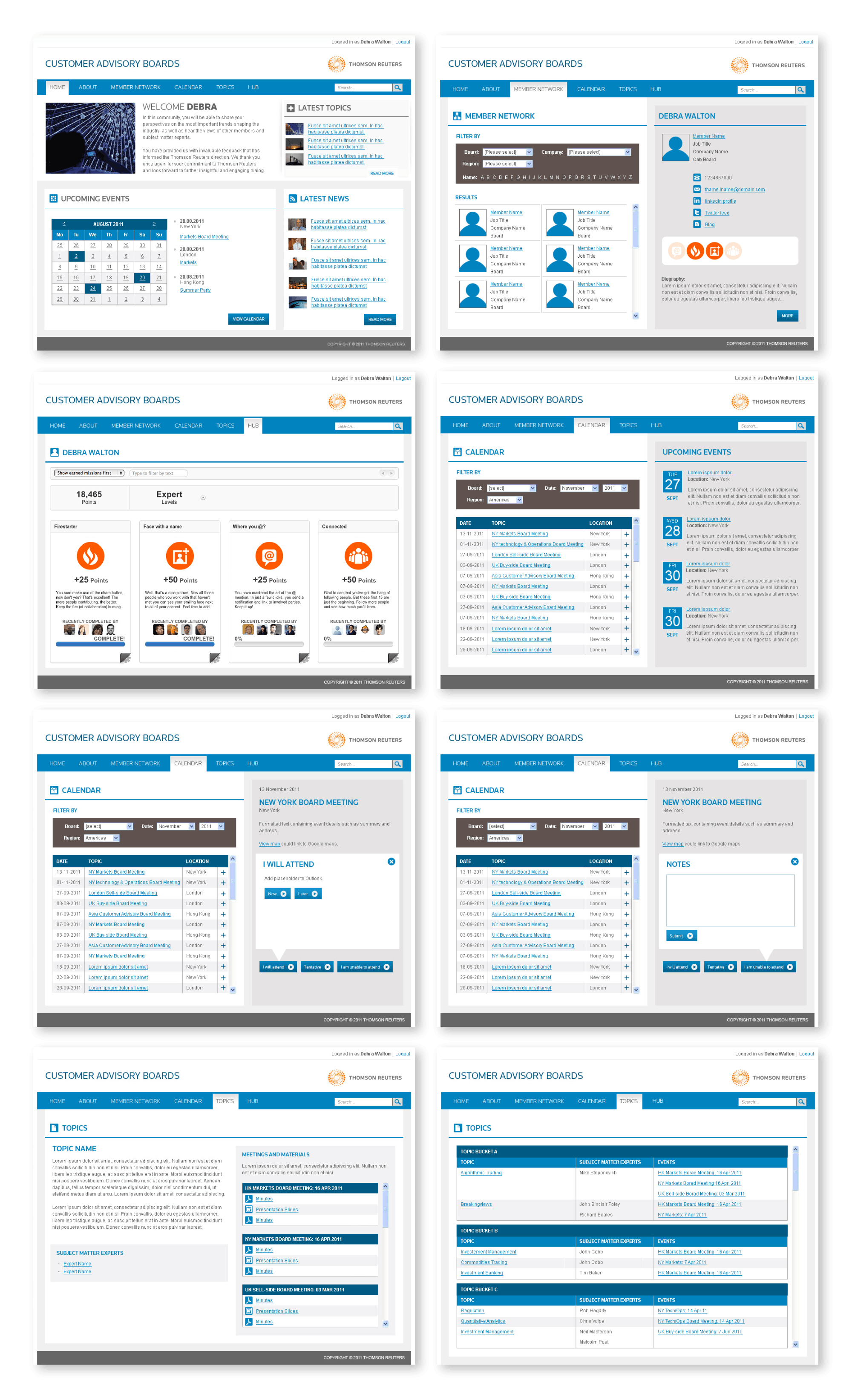
The Customer Advisory Boards project was initiated to address a lack of project transparency and communication at Thomson Reuters. Prior to this initiative clients had to reach out to project leads individually for updates, an inefficient process that placed a burden on both clients and internal teams.

Internally, project managers and team members depended on disconnected tools such as email threads, spreadsheets, and personal task trackers to manage deliverables and monitor progress. This led to delays, inconsistent information sharing, and reduced visibility across teams.

This platform was envisioned as a centralised, user-friendly solution that would streamline communication, improve transparency, and create a single source of truth for all project-related activities.
Screen
Focus was placed on the following key objectives:
2. User Research

To better understand the users' needs and behaviours regarding goal setting and task management, a comprehensive set of surveys and interviews was designed and conducted. Participants were selected from internal teams at Thomson Reuters, all of whom had experience in project management. A total of 30 project managers and 15 other team members (including stakeholders and clients) participated in the research.

Key Insights
Organisational Needs
85%
of participants expressed frustration with existing tools, citing challenges in staying organised and managing multiple projects simultaneously.
92%
of project managers reported the need for a clear, consolidated view of goals and tasks to help them prioritise work and track progress.
Goal Setting & Task Tracking
78%
of participants highlighted that they struggled to see how individual tasks aligned with larger project goals, leading to confusion and inefficiency.
69%
of users reported existing tools lacked an intuitive way to track task dependencies and progress, making it difficult to see how their work contributed to the overall project.
Visibility & Progress
84%
of users noted that they wanted a solution that provided real-time updates, allowing them to see progress and identify potential delays earlier.
60%
of project managers mentioned that they often received requests for status updates from clients, which were time-consuming and inefficient.
Collaboration & Communication
75%
of participants said features like shared task lists, comments threads, and the ability to assign responsibilities would improve collaboration.
52%
of users also mentioned they needed a central location for all communications and documents related to tasks to avoid confusion.
3. Competitor Analysis

A competitor analysis was conducted on a selection of popular task management applications (shown below), including Google Calendar, Google Keep, Habitica, Trello, Swipes, Toodledo, Microsoft Planner, Mac Stickies, and Android QuickMemo+. The objective was to assess the presence of key features across platforms and to identify potential gaps in functionality.
Competitor Analysis
The analysis showed that core features such as account login, mobile and desktop access, and the ability to check off completed tasks were widely supported. Many of the tools also allowed collaboration with other users, assignment of due dates, and delivery of notifications, indicating that these were considered standard capabilities in task management solutions.

However, several limitations were identified:
4. Application Map

Based on the research findings and competitor analysis, a draft application map was developed to define the structure and flow of the product’s features (shown below). The map was designed to prioritise functionalities identified by research participants as most valuable, such as the ability to create and manage goals and tasks, integrate with a calendar, and receive reminders.
Application Map
The structure began at the splash screen and branched into account-related actions including account creation, onboarding, sign-in, and password reset. From the central home/dashboard screen, navigation paths extended to major functional areas: My Goals, My Tasks, My Calendar, Settings, Archive, Trash, and Help. Each of these sections contained specific functions, for example, editing or deleting goals and tasks, scheduling calendar items, setting reminders, and managing user preferences.

The map visually demonstrated how different components of the application were organised and related to one another within the product’s information architecture. It also supported feature planning by clarifying the hierarchy and flow of content, with lifecycle management reflected in the inclusion of archival and deletion options. This structure laid the groundwork for future wireframing and interface development.
5. Wireframing

The insights from user research and the application map were key drivers in the development of the first set of low-fidelity wireframes. These wireframes captured the core structure of the app, reflecting the essential interactions and functionality that users required.

The wireframes focused on:
Please click the thumbnail below to see the wireframes in more detail.
Wireframes
6. Visual Design

Following the review of findings from the initial research phase, it was noted that many competitor products favoured a blue colour palette, often associated with trust, calmness, and approachability. However, further consultation with stakeholders revealed a strong preference for the design to be aligned with the Thomson Reuters brand colour scheme.

As a result, two design options were explored: one featuring a brand-focused orange and yellow palette, and another with a blue-based colour scheme. The designs are shown below:
Orange
Blue
Design Options
The blue colour scheme was ultimately selected after stakeholders were convinced that it provided a fresh, distinct look that set the product apart from competitors. Its ability to convey reliability, professionalism, and efficiency aligned with the core values of the task management tool, helping to establish a sense of trust and authority.
7. Gamification Guide

To address the gap in motivational features identified during competitor analysis, gamification was introduced into the platform. A badge-based reward system was implemented to recognise and celebrate user progress. Users would earn badges upon completing key goals or milestones, creating a sense of achievement and encouraging continued engagement.

This approach aimed to improve accountability and encourage a more rewarding experience, especially for users managing complex tasks over extended periods. To ensure consistency in tone, visual style, and reward levels, a dedicated Badge Creation Guideline was developed. This guide provided direction for designing and integrating badges into the interface, outlining badge types, criteria for achievement, and visual specifications..

A dedicated section within the platform, called the Hub, was introduced to showcase earned badges and achievements. This centralised area allowed users to track their progress, view completed milestones, and stay motivated through visual recognition of their efforts.
Slide 1
Slide 2
Slide 3
Slide 4
Slide 5
Badge Guidelines
8. Final Design

After several rounds of usability testing and iteration, the design was further refined to ensure an optimal user experience. The high-fidelity composites of key pages were created, incorporating the Thomson Reuters branding and visual design elements. These refinements addressed user feedback, improving both the functionality and aesthetics of the interface.

The final design successfully blended usability with the company's established brand identity, delivering a polished and cohesive product ready for development.
Scroll Here
Final Screen Designs
9. Conclusion

Working on this project proved to be an invaluable learning experience and my first exposure to UX design. It reinforced the significance of a user-centred design approach, shaping my focus on addressing the real needs of the users, rather than getting caught up in design trends. The experience highlighted the critical role of understanding both visual design and UI to create interfaces that are functional, engaging, and intuitive. Continuous iteration and feedback were key to ensuring the final design was both user-friendly and aligned with the Thomson Reuters brand.

Key takeaways from this project included the understanding that unstructured testing often yields more valuable insights than formal goal-setting tests, and that higher-fidelity prototypes, while helpful for user understanding, can sometimes lead to frustration when users are unable to perform complex actions. Ultimately, it became evident that gaining a deep understanding of the problem and the users it affects is far more valuable than pursuing trendy or superficial solutions.

This project reinforced the idea that good design is a balance between meeting user needs, staying aligned with brand identity, and ensuring ease of use, lessons that will continue to inform future design work.