Playtesting Hub
2K Games
Contents
Intro
The 2K Games Playtesting Hub was a streamlined platform designed to simplify the process of registering for and managing playtests. By providing a seamless experience for users and administrators, it ensured a more efficient and competitive environment for testing upcoming games.
Challenge
The existing playtesting system was outdated, offering limited functionality that couldn’t keep up with industry competitors like EA and Ubisoft. Users faced difficulties in registering and managing their profiles, while administrators struggled with playtest management and key distribution, hindering overall efficiency.
Solution
The Playtesting Hub was redesigned to include an intuitive registration system for users, with enhanced profile management. Administrators were given tools to efficiently set up, manage, and update playtests, while key distribution was simplified. This revamp provided a more comprehensive and user-friendly solution.
1. Introduction

The original one-page Playtest Hub faced several challenges that limited its effectiveness and user engagement. There was no backend admin section to manage user data, and only basic information was being collected, such as full name, age, country, and email address. Use the comparison slider below to explore the before and after designs.
Before
After
Playtest Enrollment Website
Below are the key issues that were identified with the current platform:
The objective of this project was to redesign and rebuild the Playtesting Hub to increase user engagement, improve accessibility, and align with industry standards. By creating a visually engaging, informative, and user-friendly platform, the goal was to drive higher traffic, enhance user participation in playtests, and provide a better experience for both 2K Games and their community of players.
2. User Research

User Research Report To evaluate the effectiveness of the playtesting platform, a comprehensive user research study was conducted. Surveys were distributed via SurveyMonkey to 500 randomly selected users registered on 2K.com, with 67 responses received from participants spanning diverse age groups and demographics.

The research focused on identifying pain points, assessing the potential for a dedicated Playtest Hub, and gathering insights into desired features and improvements.

Please click the thumbnail to view the detailed user research report.
Key Findings
The following quote from a user perfectly captured the main shortcomings of the existing user experience of the website:

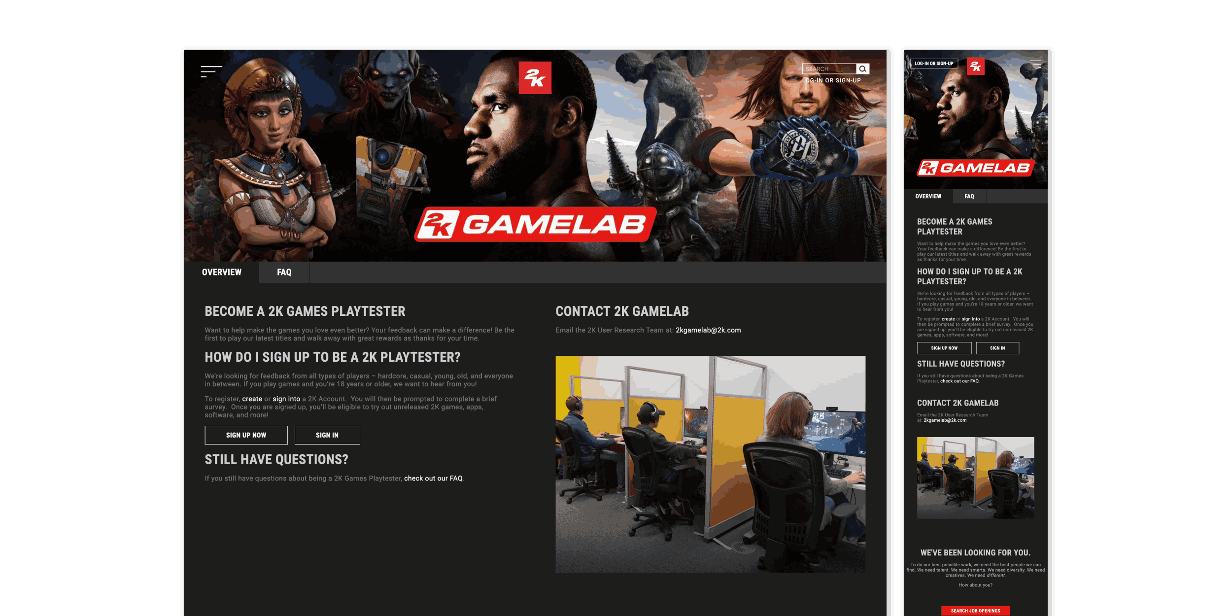
The site felt bare-bones, navigation was confusing, and there wasn’t much value beyond the form. It didn’t feel engaging and wasn’t intuitive, especially for someone new.

3. Competitor Analysis

An analysis of five major platforms (Steam, Epic Games, EA, Ubisoft, and Activision) revealed key approaches to playtesting that informed the design of the Playtesting Hub. Each platform offered unique strengths and weaknesses, particularly around user experience, registration processes, and visibility of upcoming tests. By comparing these systems, several themes emerged.
Competitor Research
Competitor Research
Strengths
  • Ease of Registration: Most platforms featured a simple sign-up form or integrated sign-up flow. Steam’s “Request Access” button was especially streamlined, while Epic and Ubisoft offered basic forms with optional profile expansion.
  • Email-Based Communication: All platforms relied on email to notify users about playtest availability and session details. This allowed for direct communication but introduced potential issues around missed messages.
  • Progressive Profiling: Progressive Profiling: EA and Ubisoft implemented progressive profiling, enabling users to provide more information over time to increase relevance and selection chances.
Weaknesses
  • Lack of Visibility: Platforms like EA, Ubisoft, and Activision did not show available playtests upfront. Users had to wait for email invites without knowing what tests were active.
  • Limited Feedback Opportunities: Few platforms offered users the chance to provide feedback beyond initial sign-up, limiting community engagement.
  • Over-reliance on Email: The heavy use of email communication created potential for delays, missed invites, or uncertainty around selection.
  • No Confirmation or Progress Indicators: Some platforms (e.g., Ubisoft) failed to confirm participation, while others (e.g., EA) lacked visual progress cues during long forms, both affecting user confidence and clarity.
Insights Gained
  • Steam stood out with its embedded playtest sign-up directly in the game’s storefront, quick, visible, and requiring minimal effort. However, limited exposure and feedback diversity were drawbacks.
  • Epic Games offered a clean registration process with direct follow-up, but lacked transparency in how users were selected.
  • EA used detailed profiling and provided access to available playtests once onboarded, though the lack of form progress feedback was noted.
  • Ubisoft had a simple sign-up but failed to confirm registration or show playtest availability, leaving users uncertain.
  • Activision had the most complex form, heavily focused on Call of Duty. Despite offering a progress bar and confirmation, the experience was lengthy.
Key Findings
4. Event Storming

A series of Event Storming workshops were conducted over several weeks with around 15 stakeholders from various locations, including the US, Poland, and Dublin. These sessions aimed to map out the complete user flow, uncover system requirements, and build a shared understanding of the playtesting process across teams.

A Miro board was utilised during the workshops to visually map the system’s domain events, beginning from the initial stages and progressing in a linear flow towards the conclusion. Stakeholders placed domain events on the board, and over time, additional actions were added, each represented by different coloured sticky notes to distinguish between various elements of the system, as outlined below.
This colour-coded approach helped to clarify the relationships between domain events, commands, rules, and other system requirements, providing a clear and evolving view of the user flow, business rules, and system interactions. It was an engaging and collaborative approach that facilitated cross-functional communication with the wider team and encouraged a shared understanding among all participants.

The final flow diagrams offered a clear and structured visual representation of the full user journey. This helped define the four core areas of the system (Administration, Enrollment, Registration, and Key Distribution) and informed the development of the component specifications. Please click the thumbnail below to view the full Playtest Flow in Miro.
Playtest - User Flow
5. Solution

Following the Event Storming sessions, several key areas for improvement were identified to streamline the process for both administrators and users. The focus shifted toward enhancing efficiency and the overall user experience of the four main areas of the system. See the breakdown below for details.
Key Area
Description
Improvements Identified
1 Administration
Administrators from Technodrome would set up game titles for testing by sending game details to the system, which generated playtests and assigned players. The system would allow for easy updates to playtest details, including capacity adjustments and player removals. Key information such as title, dates, country requirements, age, and platform would be included.
  • Centralized Scheduling: Unified platform for scheduling with calendar integration.
  • Tester Analytics: Dashboards to measure engagement and performance.
  • Session Playback & Analysis: Recorded playtest sessions with annotation tools.
  • Customizable Testing Scenarios: Drag-and-drop scenario creation.
  • Issue Tracking: Integrated bug reporting with prioritization.
  • Communication Hub: Real-time updates and messaging for testers.
  • Access Control: Role-based permissions for administrators.
  • Automated Feedback Report: AI-driven sentiment analysis and reporting.
2 Enrollment
The plan was to implement a streamlined Enrollment system where users would fill out a registration form, providing essential details like name, date of birth, game interests, and country. Those who met the necessary criteria would be successfully enrolled, while users could also update their information directly within the portal for convenience.
  • Step-by-Step Enrollment: Guided process with progress tracking.
  • Single Sign-On (SSO): Seamless authentication via Google, Microsoft, etc.
  • Eligibility Check: Pre-screening to streamline enrollment.
  • Automated Status Updates: Notifications at every stage.
  • Localized Content: Dynamic language and regulatory adaptations.
3 Registration
A feature was planned to allow users to browse through a list of available playtests, with filtering options for game title, platform, and region. Once a user selected a playtest, they could register quickly by submitting their profile information and confirming their availability. If they met the playtest requirements, they would be enrolled and receive confirmation to participate.
  • Smart Match Invitations: Personalized invites based on user profiles.
  • Real-Time Availability: Live updates on open playtest slots.
  • Waitlist & Scheduling Tools: Automated notifications for openings.
  • Interactive Calendar: Visual scheduling and easy session selection.
  • Quick Registration & Reminders: One-click re-enrollment and notifications.
4 Key Distribution
The key distribution process was set to be automated, with keys assigned to users based on their region and platform preferences. This would ensure that the correct participants received the right version of the game for their location and device. The system aimed to minimise errors by matching playtest requirements with user profiles, ensuring efficient and accurate key distribution.
  • Automated Assignment: Instant key allocation upon approval.
  • Multi-Platform Compatibility: Keys matched to user preferences.
  • Redemption Tracking: Insights into key usage and engagement.
  • Secure Delivery: Encrypted key distribution with authentication.
  • Replacement & Suspension: Self-service key replacement and admin controls.
6. Wireframing

Using the rules established during the Event Storming workshop, the following set of wireframes were developed:
Administration - Wireframes
Playtest Hub - Concepts
Playtest Hub - Wireframes
7. Prototyping

Prototypes were created for the four core areas of the playtesting project as part of a collaborative walkthrough with the 2K team. These sessions helped surface valuable feedback, uncover potential design and technical challenges, and resolve issues ahead of development. This iterative approach played a key role in refining the user experience and aligning the output with the team's broader vision. Links to the Figma prototypes are provided below.
1Administration
Administration 
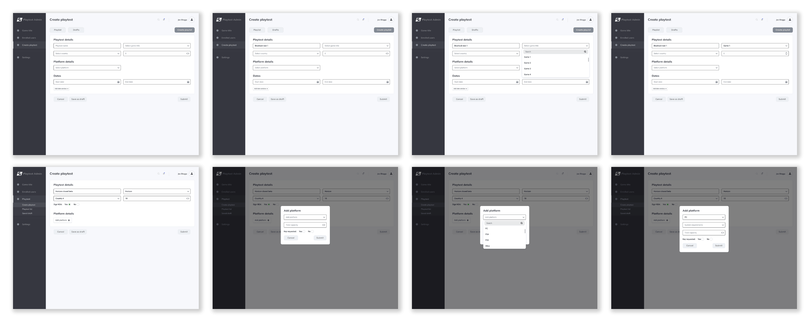
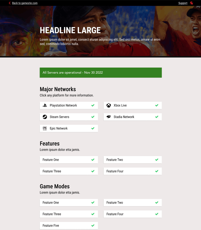
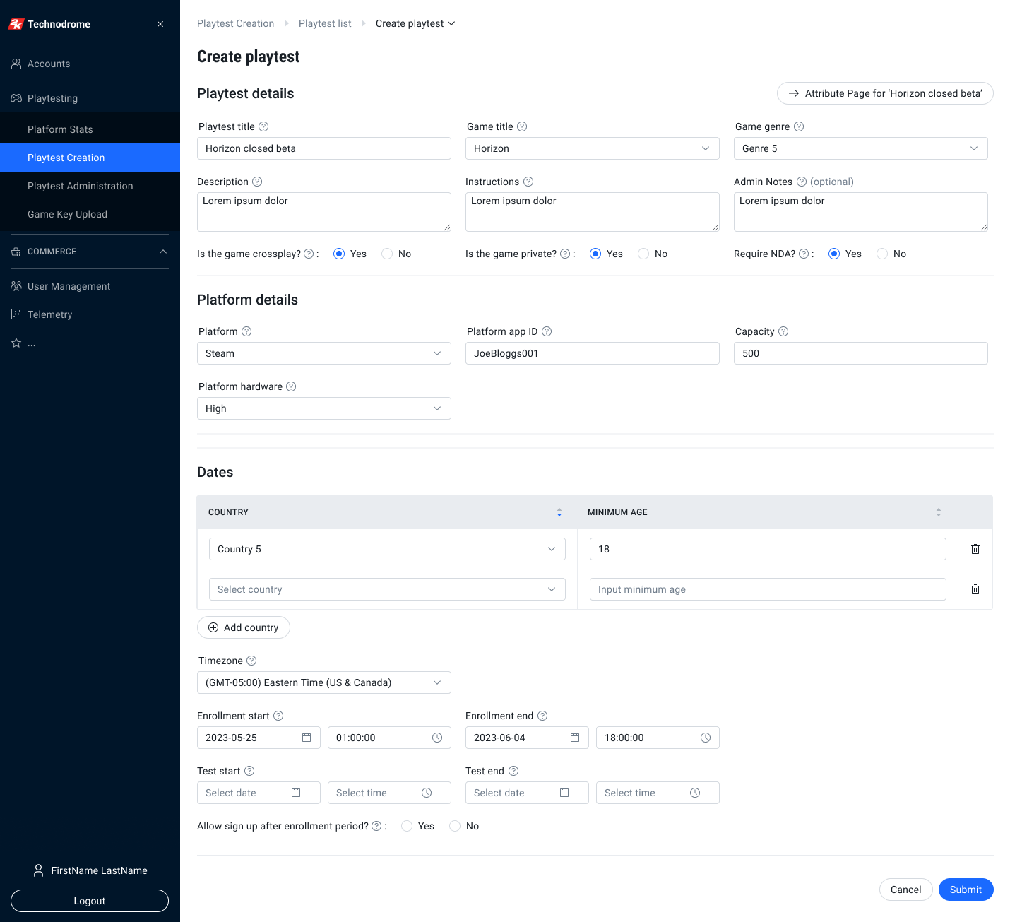
The Administration prototype was created using the Technodrome design system, ensuring visual and functional consistency with the broader ecosystem. However, it quickly became clear that the design system needed to evolve to support more modern UX patterns and component flexibility. This led to the creation of an Updated Technodrome design system. which incorporated revised components and layout improvements.

Following the initial prototype presentation, several enhancements were made based on user feedback, aligning the playtesting experience more closely with user expectations:
  • Table Filtering: Filtering was added to tables for improved usability.
  • Pagination: Pagination was enabled for easier navigation.
  • Breadcrumb Fix: Breadcrumb navigation was improved for clarity.
  • Text Area Adjustments: The maximum character count for multi-line textboxes was increased.
  • Date Format Fix: The date format was standardised across the prototype.
  • Alert Modal Update: The alert modal for deleting a user was revised to enhance clarity and ensure user confirmation.
2Enrollment
Enrollment 
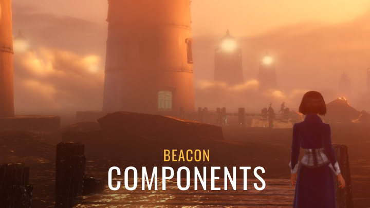
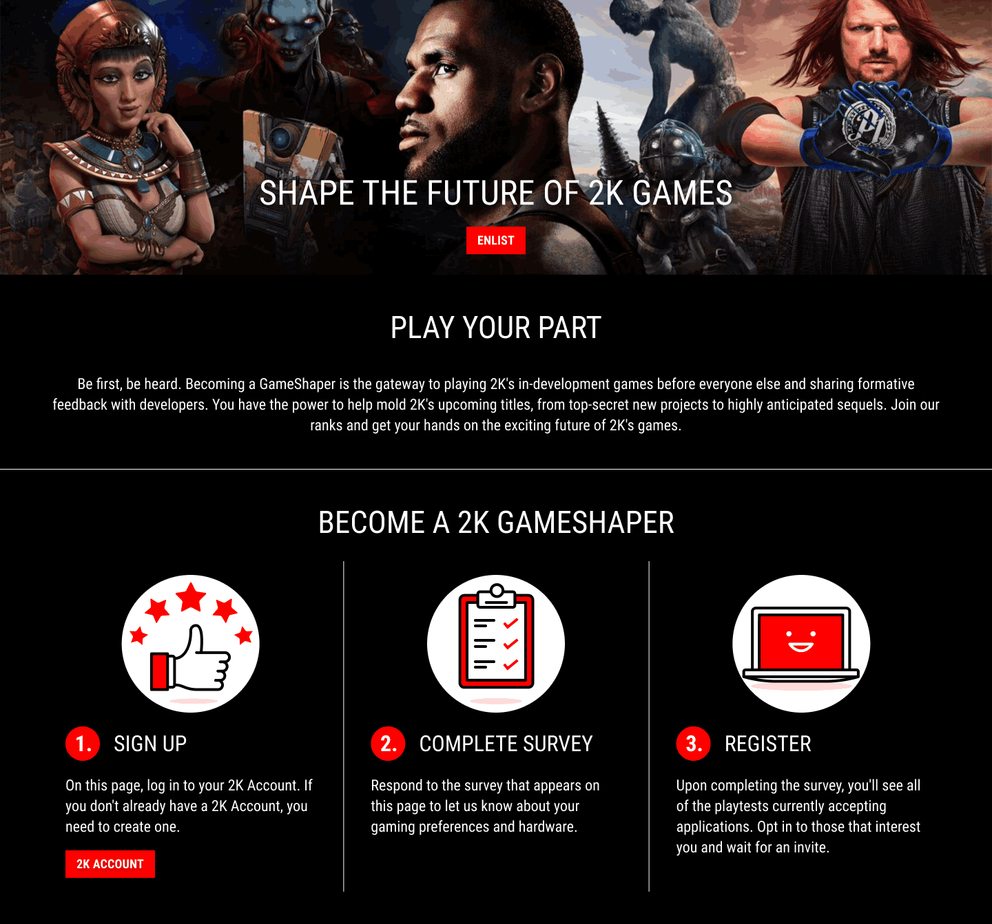
The Enrollment prototype was built using the Beacon Components Library design system, with the goal to introduce users to the playtesting experience, encouraging sign-ups while providing clear information.
  • Teaser: The page began with an engaging teaser that highlighted the benefits of playtesting, such as exclusive access to upcoming games and the opportunity to shape game development.
  • Registration Form: A simple form captured essential details like name, email, and platform, making the sign-up process quick and easy.
The prototype aimed to provide a smooth and visually appealing introduction to the playtesting process, setting the stage for the subsequent Registration page.
3Registration
Registration 
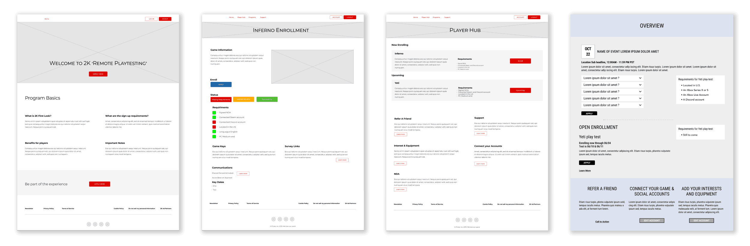
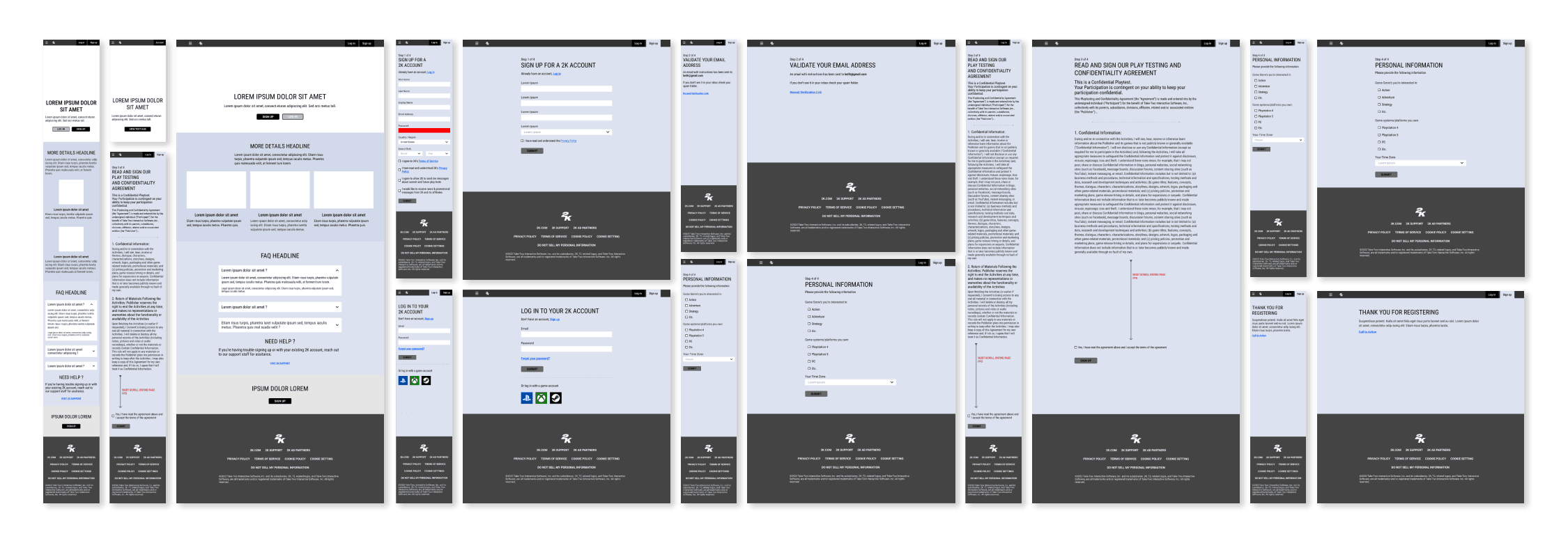
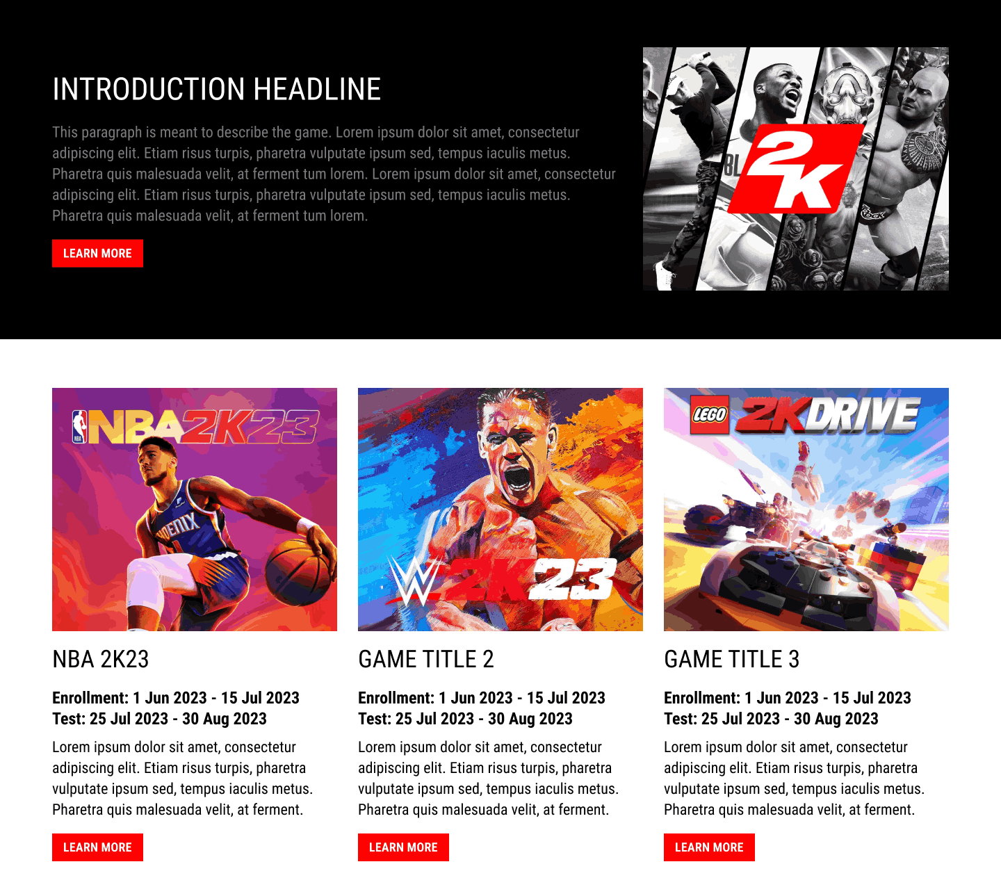
The Registration prototype was designed to streamline the process for users to sign up to specific playtests after completing enrollment.
  • Available Games: Once users signed up, they were presented with a list of games available for playtesting. Each game included key details such as genre, platform, and playtest schedule.
  • Registration Options: Users could select their preferred game and register directly from the list. The registration process was kept simple with a single click to confirm participation.
  • Game Details: A detailed view was available for each game, showing additional information like testing requirements, game description, and expected testing duration.
The prototype focused on delivering a smooth, user-friendly experience that allowed users to quickly browse available playtests and sign up with minimal friction.
4Key Distribution
Key Distribution 
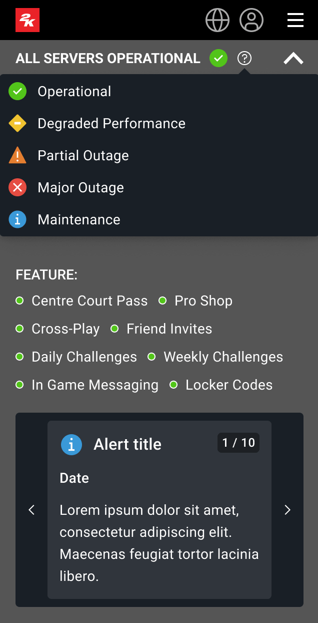
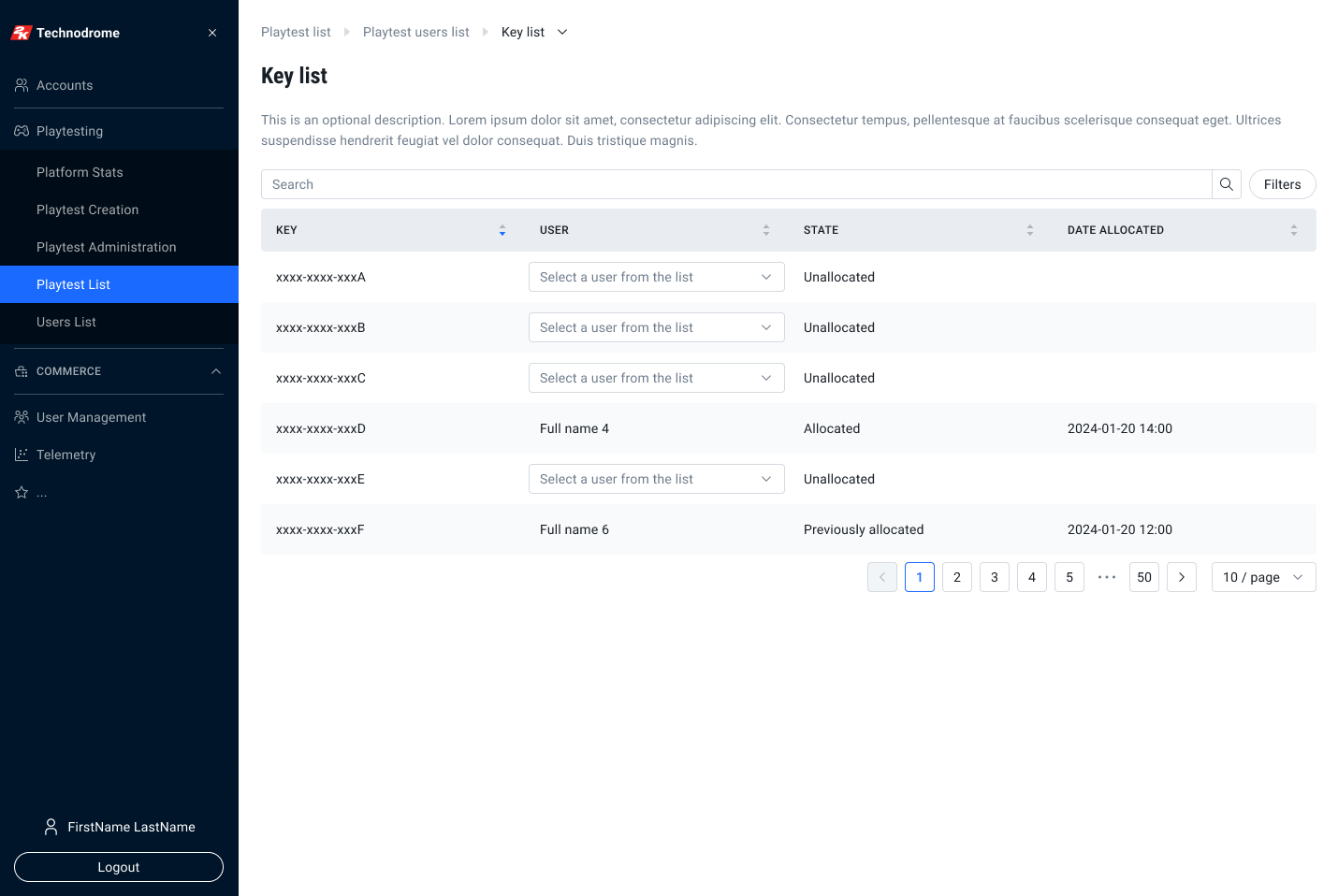
The Key Distribution prototype was built using the Technodrome design system, which focused on managing and distributing game keys for playtest participants, ensuring a seamless and efficient process for administrators.
  • Key List: A comprehensive list displayed all game keys available for distribution, showing the status of each key (e.g., pending, sent, etc.). This allowed administrators to track key availability and distribution progress.
  • Keys Requested: The prototype included a section that displayed the number of keys requested by participants for each game, ensuring that key distribution aligned with demand.
  • Initiate Key Send: An intuitive action button enabled administrators to quickly initiate the sending of keys to users. This feature streamlined the distribution process, reducing the time spent on manual tasks.
  • Key Upload (Steam / Xbox / Playstation): The prototype provided options for administrators to upload keys specific to different platforms, such as Steam, Xbox, or PlayStation. Each platform had its own dedicated upload area, ensuring that platform-specific keys were handled correctly.
  • Navigate to Key List: A simple navigation flow was incorporated to allow administrators to easily move between the key distribution section and other related pages, such as the Registration or Game Management sections.
  • Gameshapers - Allow List: The prototype also featured an “Allow List” for Gameshapers, ensuring that only approved participants had access to certain game keys. This added a layer of security and control over key distribution.
The prototype aimed to simplify the key management process, ensuring that administrators could efficiently distribute keys while maintaining control over access and tracking.
Gameshapers - Horizon
Gameshapers - Horizon 
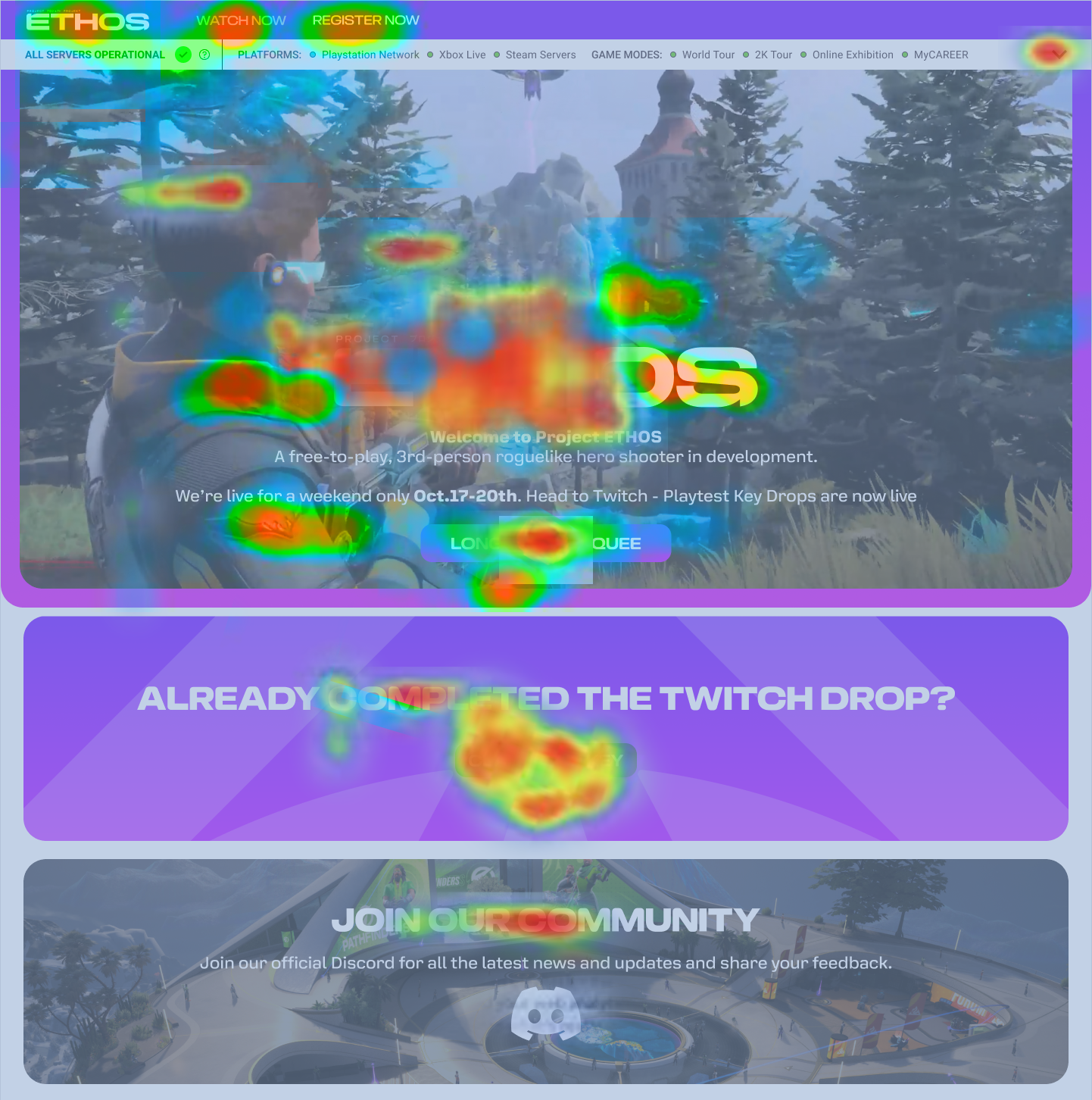
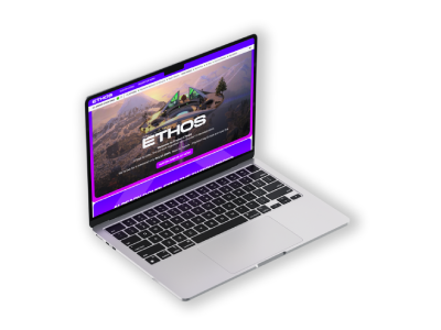
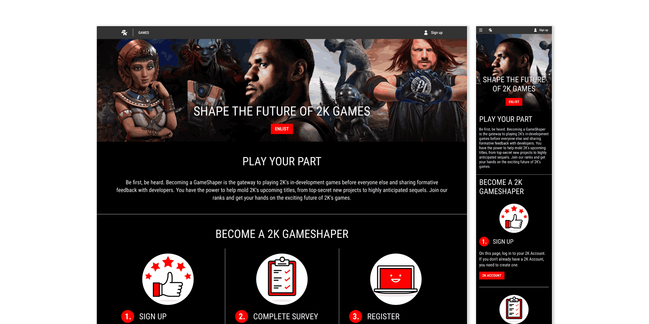
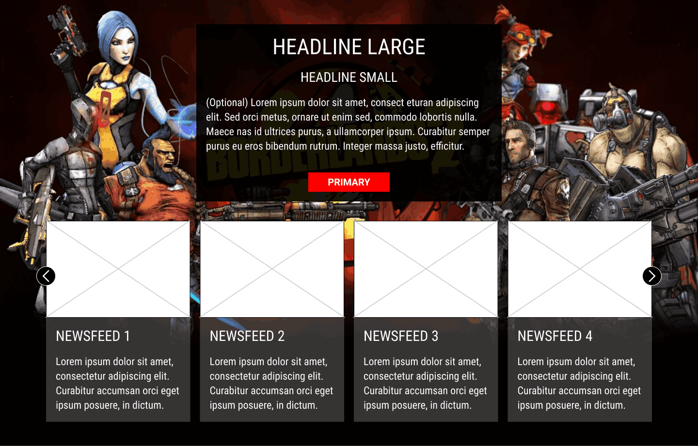
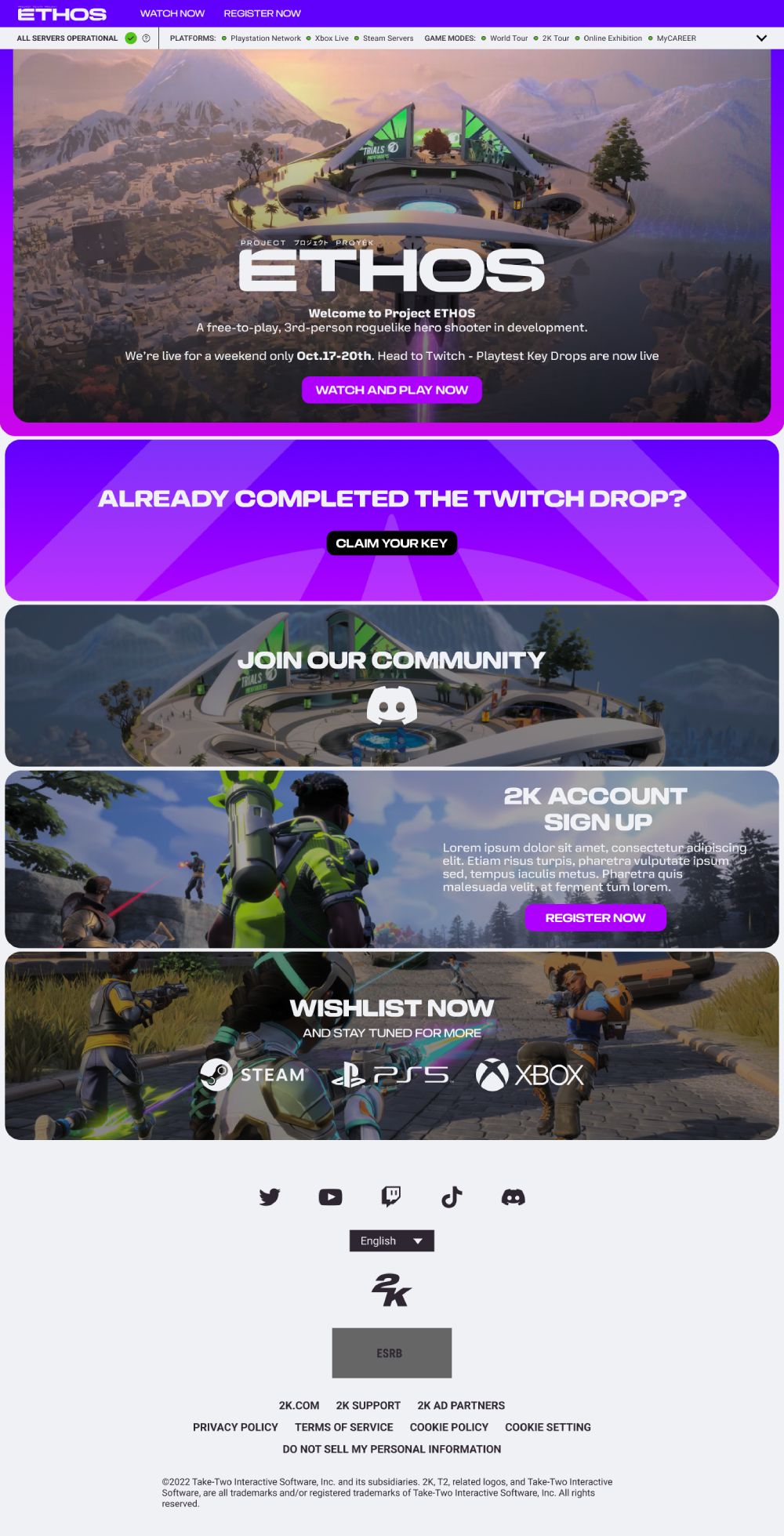
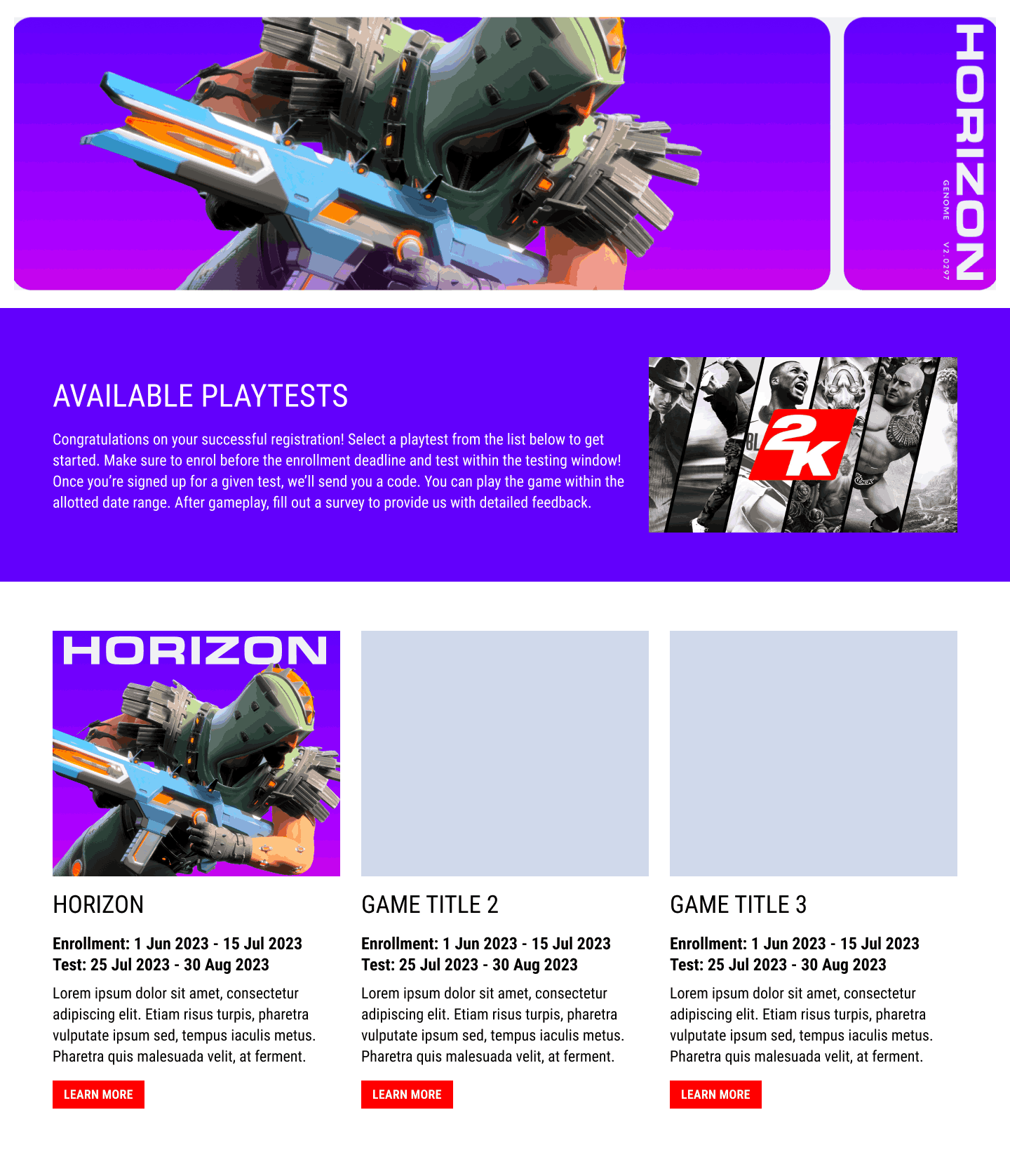
Midway through the project, the decision was made to rebrand the Playtesting Hub as Gameshapers, with Horizon, an upcoming Free-to-Play game title, selected as the first project to launch on the platform. The goal was to create an engaging, visually compelling website that captured the game's essence while providing a seamless user experience.
  • Landing Page - Editability: A key feature of the prototype was the ability to edit the game homepage. This section allowed administrators to update content, such as promotional banners, game descriptions, and news updates. The editable content ensured that the homepage remained dynamic and could easily be updated to reflect new game features or upcoming events.
  • On-Screen Key View: Provided players with a clear, easy-to-access view of their game keys, displaying the status of requested keys and allowing them to quickly retrieve and activate their keys for the upcoming playtest.
8. Design System

Old Design System
Old Design System
During the development of Gameshapers, it became clear that the existing design system’s components library, known as the Beacon Components Library, was outdated and not fit for purpose. Several new components had to be created from scratch to meet the unique requirements of the Playtesting Hub.

Old Design System
New Design System
Below are some examples of new components that were created for the new design system, each requiring careful attention to functionality and design to ensure a seamless user experience. Some also included a detailed component specifications to allow developers to easily implement the design, while the flexibility built into the system enabled future iterations and additions with ease.

New Navigation New Old Navigation Old
Navigation & Menus
The navigation and menu systems were completely overhauled. Previously, the site used a slide-out side panel that behaved like a mobile menu, even on desktop. There was no separate navigation system designed for larger screens, which led to a clunky user experience and made it harder to browse multiple sections efficiently.

The redesigned interface introduced a full mega menu, improving user flow and accessibility. The new layout offered a more intuitive structure, making it easier for users to quickly navigate through the site.

Prototype
New Server Status Component New Old Server Status Component Old
Server Status
The server status component was completely overhauled to provide real-time updates on the status of game servers. Previously, server information was accessed via a separate page, linked from the individual game title page. This required users to navigate away from their current view, disrupting the experience. In the new version, server status details were made available directly within the game title page through an accordion-style dropdown. This allowed users to check server performance and downtime quickly without leaving the page.

Old Server Status Prototype
Interactive Map
Interactive Map
The interactive map component was created from scratch, as no existing version was available. It was designed to deliver dynamic, real-time visualisations of game locations and events, enhancing engagement through updated visuals and smoother functionality.

Prototype
Twitch Drops
Twitch Drops
The Twitch Drops component was a new development introduced in response to user demand for Twitch integration. It was designed to better track and display rewards from Twitch streams, enhancing its connection to the gaming ecosystem and making it easier for users to monitor progress and claim rewards.

Prototype
Countdown
Countdown
A new countdown timer component was developed to build anticipation around the upcoming game launch. Designed to deliver clearer and more accurate time tracking for time-sensitive events, promotions, and releases, it ensured users remained informed and engaged ahead of key activities.

Prototype
Sticky Banner
Sticky Banner
The sticky banner was redesigned to improve visibility and user engagement. It remained fixed in place and was used for important announcements, allowing users to access key information easily without disrupting their browsing experience.

Prototype
Popup Banner
Popup Banner
The popup banner was refreshed to provide a more interactive and visually appealing notification system. It delivered important messages or calls to action more effectively, with smoother transitions and improved integration with the rest of the site.

Prototype
Marquee
Marquee
The marquee component was updated to display announcements, news, or updates in a scrolling format. Previously, the component offered limited variation and did not allow for the inclusion of elements like a ticker-style featured section. The updated version supported dynamic content and functioned seamlessly across different screen sizes, ensuring important information reached users without cluttering the page.

Prototype
9. Final Design

The final design of Gameshapers incorporated feedback from stakeholders and users, along with improvements from wireframing and prototyping. It delivered a seamless and intuitive user experience, while remaining consistent with 2K’s brand identity.

The design focused on a clean, modern aesthetic, consistent use of the 2K brand colours, and a refined layout to facilitate easy navigation. Key components were integrated into the final layout, from the mega menu, countdown and revamped server status component, all of which were customised to fit the unique needs of the playtesting platform.

Final Design
Scroll Here
Website Screenshot
Final Design of Ethos Game Launch
10. Testing

Internal Testing Report Design Audit

To ensure the 2K Portal met the highest usability standards, a design audit was conducted alongside the refresh of the component specs. The purpose of the audit was to evaluate the portal's user interface and identify any usability problems that could hinder the user experience.

A heuristic evaluation was used as the primary method to assess the design. This usability inspection technique helps identify common interface issues by focusing on a set of established guidelines. For this audit, two key sources were referenced: Usability issues were prioritised using Nielsen’s severity ratings, providing a structured approach to addressing fixes. Click the thumbnail on the right to view the full design audit report.
User Testing

Testing was essential in ensuring Gameshapers met user needs and delivered a seamless experience. A variety of testing methods and tools were employed to optimise the design and refine its functionality based on real-world user interactions.

Hotjar for Heatmaps and User Behaviour Analysis
Hotjar was utilised to gain a deeper understanding of how users interacted with the site. Heatmaps provided visual insights into click patterns, scrolling behaviour, and areas of the site that were ignored. For example, analysis revealed that a critical "Register" button on the Registration page received low interaction because it was placed below the fold. This led to relocating the button higher on the page, significantly increasing click-through rates.
UserTesting Dashboard
UserTesting.com for In-Depth User Interviews
To gather detailed insights into user behaviours and preferences, real users were recruited through UserTesting.com for one-on-one usability testing sessions. These sessions allowed for deep qualitative feedback on user frustrations, motivations, and needs. For example, during the registration process, several participants indicated confusion around the eligibility criteria for claiming keys, prompting the addition of a clear and concise FAQ on the same page to address this issue. Other issues identified included accessibility challenges with font sizes and colour contrast, which were quickly addressed to improve inclusivity and readability.
Optimizely for A/B Testing
Optimizely for A/B Testing and Performance Optimisation
Optimizely was used to conduct A/B testing on key pages, such as the Registration and Key Distribution flows, as well as experiments on specific features like the navigation bar, key request process, and registration forms. These tests provided valuable data that informed design decisions, including simplifying the registration form by reducing the number of input fields, repositioning the "Claim Your Key" button to a more prominent location, and adjusting the layout of the Registration page for improved readability.
Continuous testing and iteration played a key role in refining the user experience and delivering a final product that was intuitive, engaging, and aligned with the project goals.
11. Conclusion

The design and development of Gameshapers was a comprehensive process that combined thoughtful wireframing, prototyping, and extensive user testing to create a seamless and intuitive platform. From the initial stages of mapping out user flows through Event Storming workshops, to the iterative design of key features like Playtest Enrolment, Registration, and Key Distribution, every step was driven by a focus on user needs and business goals.

The project required not only the creation of new components to meet unique requirements, but also the revitalisation of the existing design system, ensuring that the tools used by the development team were up to date, scalable, and flexible. Feedback from real users, gathered through platforms like UserTesting.com, Hotjar, and Optimizely, played a crucial role in fine-tuning the user experience, while A/B testing and usability sessions ensured that design choices were grounded in data.

Through continuous iteration and collaboration with stakeholders and users, the final design of Gameshapers achieved its goal of providing an engaging, user-friendly interface that supports the playtesting process. By addressing both functional requirements and aesthetic considerations, the project lays a solid foundation for future enhancements, scalability, and a positive user experience. Ultimately, the success of the hub is a testament to the power of user-centred design and the impact of thorough testing and iteration on achieving a polished final product.