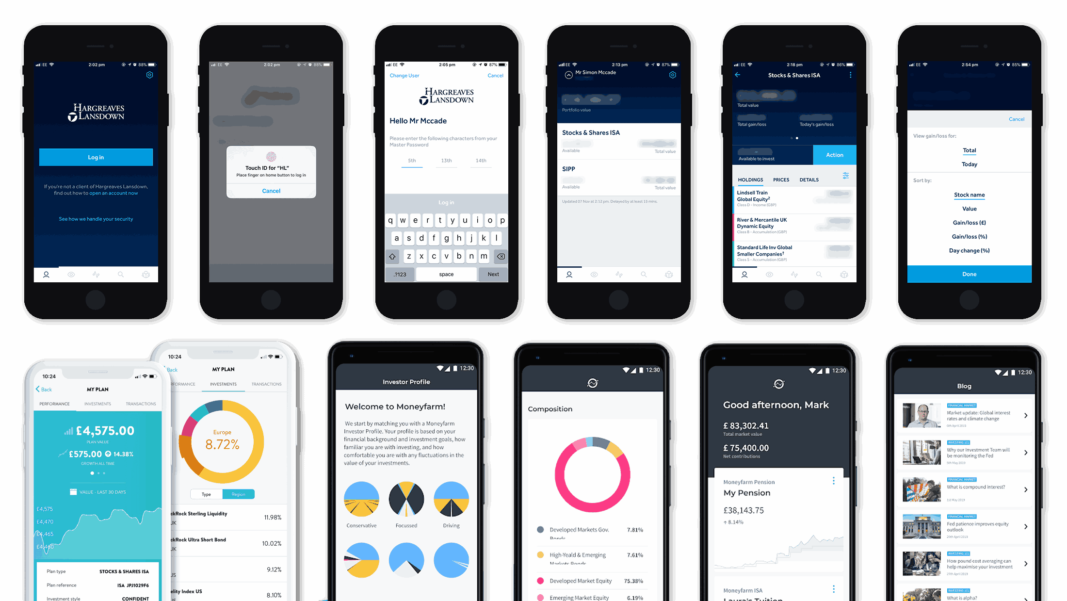
Navigation Standards
Most apps positioned core menus and charts prominently, making performance tracking and navigation quick and intuitive.
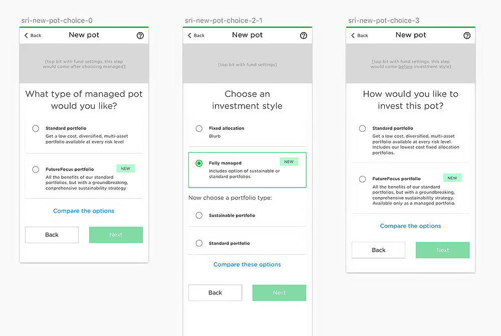
Efficient Onboarding Patterns
Several competitors streamlined the onboarding experience with progress indicators and guided steps for a smoother flow.
Clear Data Visualisation
Competitor apps used intuitive charts and investment breakdowns, offering inspiration for how to present complex information simply.
Account Transparency Features
Some competitors offered clear portfolio summaries and real-time balance updates that built user trust through better transparency.
Tone and Language Simplicity
Wealthify employed accessible language, setting a benchmark for reduced jargon and making investing less intimidating.
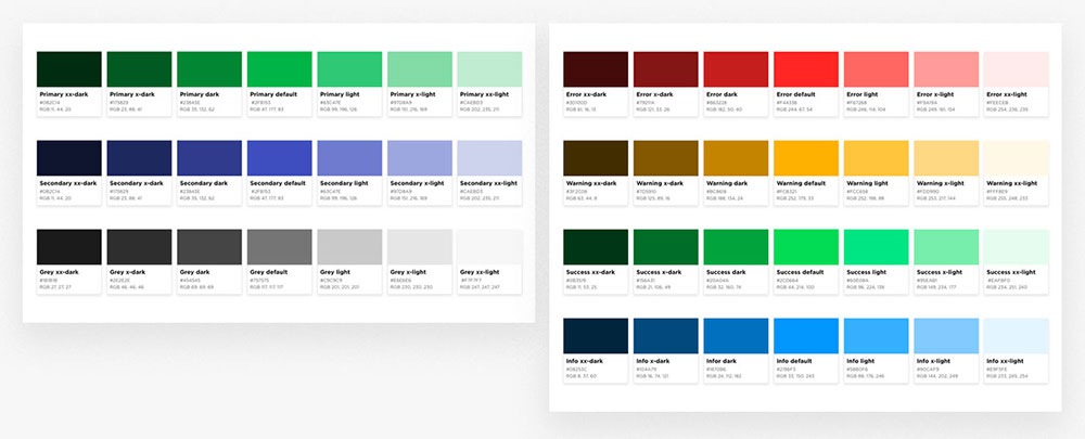
Visual Identity Gaps
Competitor platforms often relied on bland, uninspiring colour palettes that lacked distinction or emotional appeal.
Limited Personalisation
Few apps tailored content or flows based on user goals or risk appetite, resulting in a generic, one-size-fits-all experiences.
Missed Opportunities for Engagement
Very few apps made use of micro-interactions or contextual tips to keep users engaged and informed during key tasks.
Cluttered Information Hierarchy
Some apps presented information in dense blocks, increasing cognitive load and making it harder to digest key content at a glance.
These observations helped inform design decisions that aimed to position Nutmeg as a visually engaging, user-friendly, and clearly differentiated experience within the market.